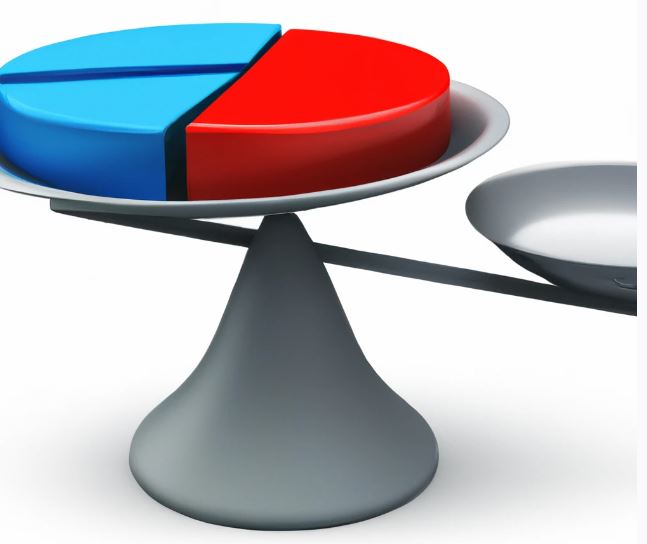
Data visualization tools are used to transform complex data into clear and visually engaging representations, helping businesses and organizations make data-driven decisions. Effective data visualization is a delicate balance between aesthetics and design principles combine with data analysis and interpretation. Here we will try to explore the key aspects of creating impactful data visualizations that strike the perfect balance between creativity and analytics.
Data visualization serves as a bridge between data analysis and decision-making. It allows us to comprehend patterns, trends, and insights hidden within the data, making it an indispensable tool for conveying information concisely and persuasively. By merging the art of design and the science of data, data visualizations facilitate better communication and understanding of complex datasets.
Clarity and simplicity are the foundation of effective visualizations. The goal of a report or chart is to convey information quickly and effortlessly to the audience. Avoid cluttering visualizations with unnecessary elements and opt for clean, minimalist designs that draw attention to the most critical data points. Clearly labeling axes, using appropriate color schemes, and providing informative titles and callouts helps in making a report clear and simple to read and understand.
The choice of visualization type plays a crucial role in conveying the intended message. Bar charts, line graphs, scatter plots, and heatmaps are just a few examples of visualization types with distinct purposes. Understanding the data and the story you want to tell will guide you in selecting the most appropriate visualization type.
Interactive elements add depth and engagement to data visualizations. Incorporating tooltips, filters, and animations enables users to explore data from different angles and draw their conclusions. Furthermore, data visualizations become more compelling when they are embedded in a broader narrative or story, guiding the audience through the data insights.
Finally, effective data visualizations consider the needs and preferences of the target audience. Design choices, such as color palettes, font styles, and layout, should resonate with the audience while aligning with the context and purpose of the visualization. By tailoring visualizations to the audience, you can ensure maximum impact and engagement.
To conclude, by striking the perfect balance between aesthetics and scientific accuracy, data visualizations become powerful tools for storytelling and data exploration.
Get your Data Visualization strategies and concepts assessed with us by clicking here.
